What happens when the stylist coincides with the tailor or the designer with the cabinet
maker?
This is another Ermesponti’s story and shows that our end-to-end method is applicable to any kind of interior, purpose and location.


What happens when the stylist coincides with the tailor or the designer with the cabinet
maker?
This is another Ermesponti’s story and shows that our end-to-end method is applicable to any kind of interior, purpose and location.
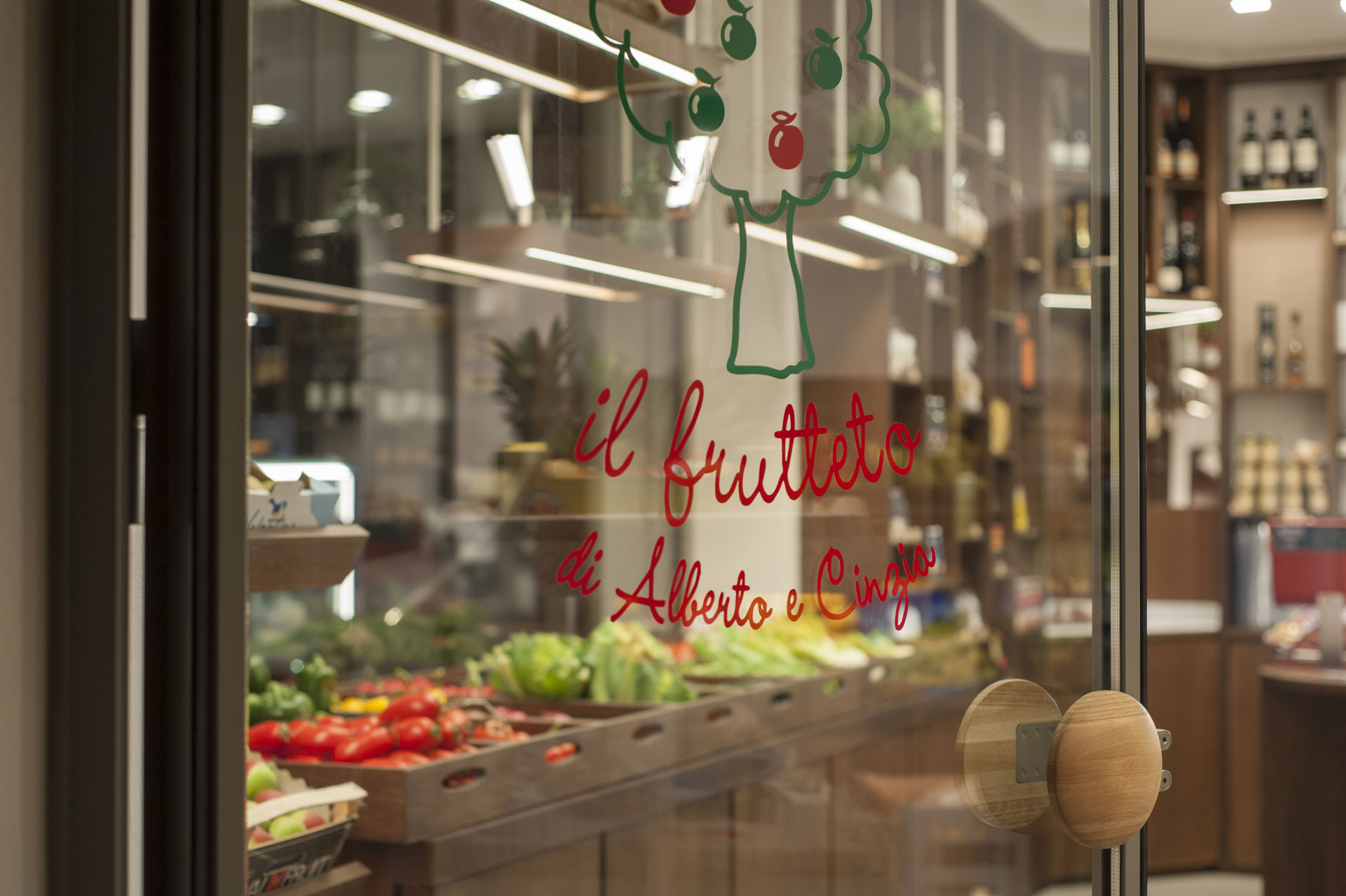
The project was to convert an old greengrocer’s shop into a modern boutique of fruit and vegetables. After a 30 year, high-quality service in the local market, the old greengrocer’s couple – Bruno and Susy- handed over the business to a young couple, Alberto and Cinzia. They felt the furniture was no longer convenient to use given the status of the shop and called Poddaponti architects to re-design the all interior and the displays .
As usual we worked on the project for several months trying to design the best solution to perfectly suit costumer requirements and taking into careful consideration the specific conditions of the location. But in the end we did all the work in less then one month, during the closure of the summer holidays. We received the keys on the 29 July and gave them back on the 26 August in order to set up and open up on the 29, as promised by the billboard pinned up outside the shutters.
The main focus of the project was about the circulating the flow of both customers and shop assistants. The old layout was completely revolutionized. The narrow shape of the old shop ( a sort of cul-de-sac shape ) was converted into a symmetrical space that was balanced around two main poles. These were the counter and refrigerated showcase on the backdrop wall and the fresh-fruit table in the centre of the shop. ( please see the scheme attached below)
The first area of the shop (around the first pole) was conceived as the most important showcase for the the core business of the shop: the ready-to-eat food, cut and mixed vegetable combinations, or fruit salads. We designed and produced a bespoke refrigerated showcase to keep the freshness of the products. ( please note the minimalist junction between the glass surfaces that have no frame). On the back a wide desk is dedicated to preparing and packaging the food-bags or the plastic boxes. At the ends of the desk two different balances were positioned in order to serve both sides of the shop. On the back a C shaped unit encircles the desk and contains all the ready-to-sell, high-quality products such as wine, Italian DOP olive oil , fruit-juice and even a smart area for rechargeable detergents.
The second area of the shop, which is near the entrance, was designed to facilitate customer flow and improve selection of the fresh fruit and vegetables shown on the desk in the middle or on the special shelves. These are against the walls and the different display of the two windows.
This new layout radically changed the way the customer walks and moves inside the shop making the flow more fluid. The first customer feedback reported that people appreciated this new feature the most. It also helps the shop assistant working in the shop, such us the daily loading and unloading of the fruit boxes through the main entrance door and the connection with the kitchen at the back door.
The site works were completed in less than one month. They started with the demolition and then – when the space was empty- proceeded with a thorough survey which as usual was the starting point of all the drawings for both the work on site and producing the furniture. According to the drawings all the new ducts ( for electrical, conditioning and plumbing systems) were cut on both walls and the floor. After that, the old floor was covered with new tiles and the window frame and rolling shutter were changed with custom-designed ones. ( please note the cross-section which is lighter than the industrial profile you usually find on the market). Then, the old walls and ceiling were covered with plasterboard and eventually painted so that the room was ready to install the furniture. The last week was dedicated to installing the new bespoke furniture. The new stainless steel refrigeration room for the fruit boxes was completely covered with the same wood veneer that was used in the rest of the furniture. On the top, 18 fruit boxes were designed and made-to-measure using the same wood. Even the existing refrigerator case was given a new look by covering the metal crankcase with wood.
In order to give the feeling of a wider space we decided to use light colours on the walls and ceiling and improve this effect with wash-wall, LED stripes. The furniture is mainly made with plywood of okumè ( the same we use for Sanlorenzo yachts) for its properties of water resistance. The veneer is a special thermo-treated oak with a hue which underlines the beautiful grain of the wood. The floor was covered with an extremely thin, large ceramic tiles, (Kerlite) which is ideal for this purpose and has special antimicrobial features. We chose a neutral colour and diagonal pattern in order to conceal the profile of the crooked walls ( which is normal in an old building in the city centre like this).
Outside the shop at both sides of the entrance two trolleys were positioned to showcase the fresh fruit boxes and vegetables. They were covered with a special outdoor wood, Accoya. Its main characteristic is to resist humidity and sunlight. It doesn’t not need any maintenance because its colour naturally changes from white to grey over the years.The same accoya wood has been used for the lower part of the window in via Ippolito Nievo. It looks like a giant fruit box from the outside.
Flagship Store
Flagship Store
Flagship Store